Editor-TextBox
Description
Inserts an Editor for editing a value using a TextBox control. IMPORTANT: This control MUST be inserted inside an Editor-Set control.
The Editor-Textbox control provides an easy way of avoiding the creation of multiple textbox controls inside of a component. This is very useful if you want to design a component that has many controls but that is also quick in performance and small in size. All editor types, such as Editor-TextBox or Editor-List, must be enclosed inside of an Editor-Set. An Editor-Set is a sub-type of the [Container] control that can be found in the 'Containers' menu.
A frequently used pattern in creating UX components with editors is to place an editor inside an editor-set. Both the editor and editor-set are then tied to items in a Form View control on the Form View Builder's Fields pane. The Form View view is often tied to a List Control. The List Control feeds the Form View data from a given row of a database. The Form View creates 'items' from the data and can display these items as HTML, much in the same way that a Detail View would. If the item is tied to an editor-textbox then the data will be able to be edited in a textbox. For a step by step example on how to achieve this see the guide below.
Create a Form View that uses an Editor-Textbox.
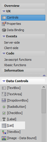
In the UX Builder, on the UX Controls page, open the Data Controls menu and click on [List] to add a list control to the component.
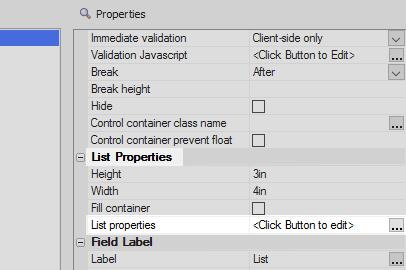
Highlight the List control in the controls tree. In the properties list on the right click on the 'List properties' property under the List Properties section. The List Builder will open.
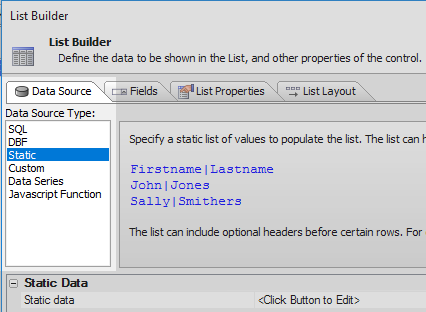
Open the List Builder's 'Data Source' pane and from the Data Source Type list select the 'Static' option.
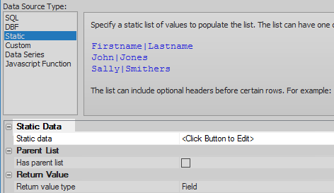
In the Static Data section of the properties list below click the [...] button next to the Static data property.
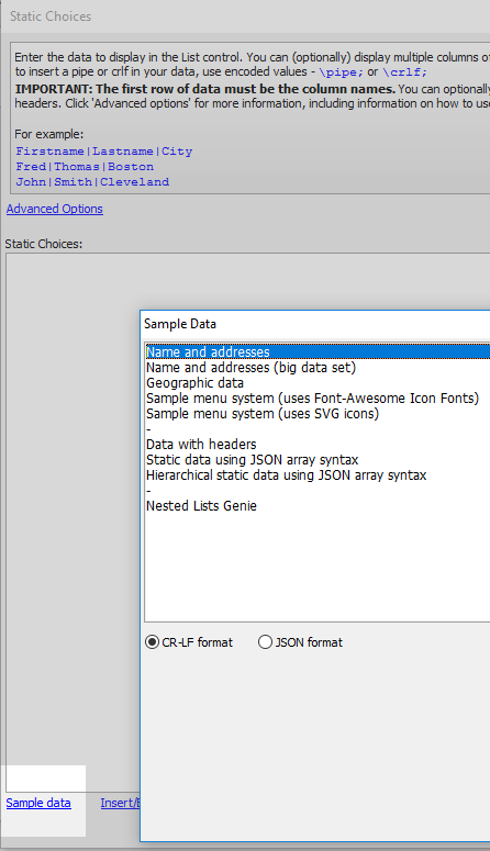
Click the 'Sample data' button, select the 'Name and addresses' option, and click OK and OK again to close the Static Choices dialog.
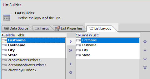
Open the 'List Layout' pane. Highlight the four data fields in the Available Fields list and use the blue > arrow to move them all over to the 'Columns in List' section. Click OK to close the List Builder.
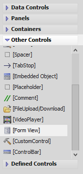
Open the 'Other Controls' menu and click on the {Form View] option to add a Form View control to the component.
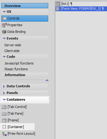
Highlight the Form View in the tree. Open the 'Containers' menu and click on [Container].
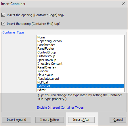
From the 'Container type' list select the 'EditorSet' container and click 'Insert After'.
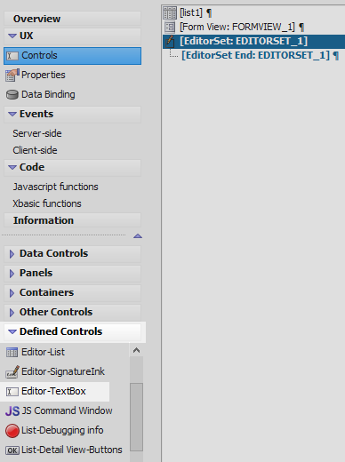
Highlight the EditorSet in the tree. Open the 'Defined Controls' menu and click on the Editor-Textbox option. Leave the name as 'EDITOR_1' and click OK to add the Editor-Textbox to the EditorSet.
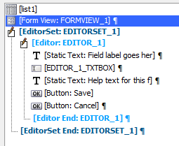
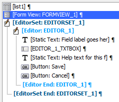
Highlight the Form View control. The component should look like this:
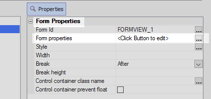
In the properties list on the right click the [...] button next to the 'Form properties' property. The Form View Builder will open.
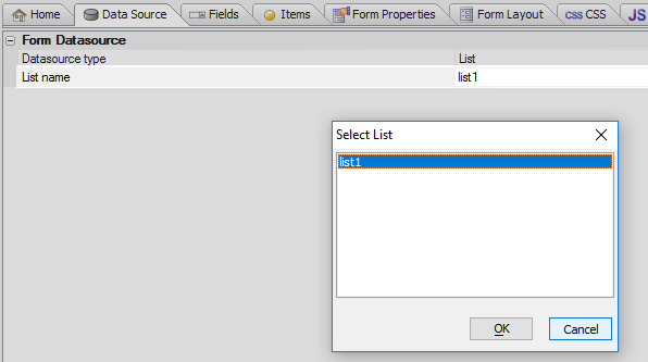
Open the Form View Builder's Data Source pane. Set the 'Datasource type' to 'List' (this should be set by default).
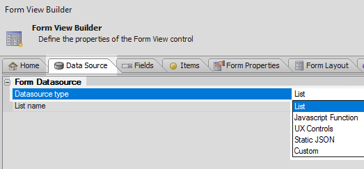
Set the 'List name' property to be the list control you defined, 'list1'.
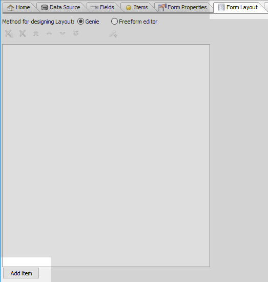
Open the 'Form Layout' pane and click the 'Add item' button.
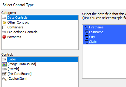
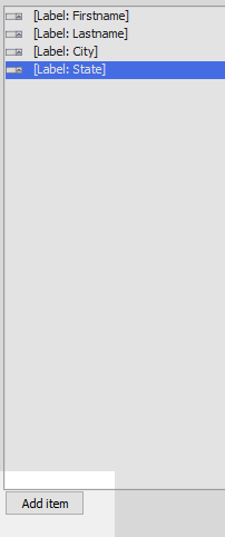
In the 'Select Control Type' dialog select 'Data Controls' from the Category menu. From the 'Control:' menu choose the [Label] option. A list of the Static Data fields from the list control should appear on the right. Highlight all of the fields and click OK to create items from them..
Click the 'Add item' button again.
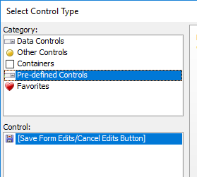
In the Category menu select the 'Pre-defined Controls' option. In the Control menu select the [Save Form Edits/Cancel Edits Button] option and click OK.
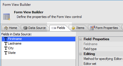
Open the Fields pane. In the 'Fields in Data Source' list highlight the 'Firstname' field.
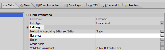
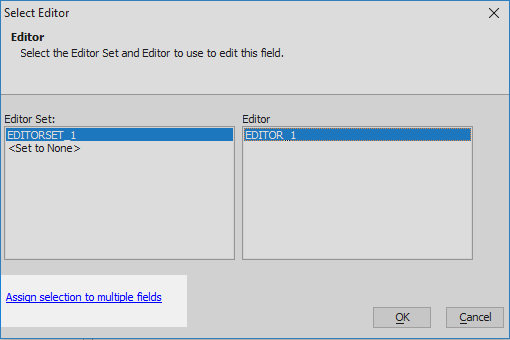
In the Field pane's properties list find the 'Editing' section. Click the [...] button next to the 'Editor set' property.
In the 'Select Editor' dialog highlight the 'EDITORSET_1' control in the "Editor Set:" list, this editor-set container you defined. In the "Editor:" list select 'EDITOR_1'. EDITOR_1 is the Editor-Textbox that was added to the component.
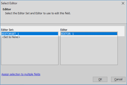
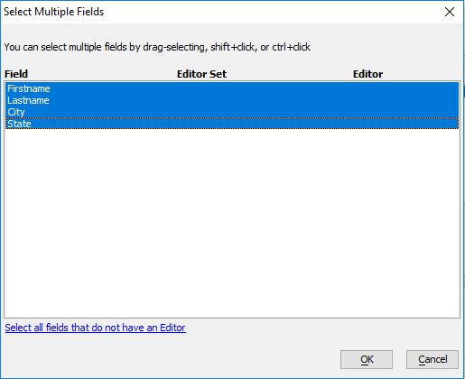
Click the 'Assign selection to multiple fields' button.
Highlight all of the fields and click OK. This will create a textbox editor for each item in the FormView but will use only one Editor-Textbox to accomplish this feat.
Click OK to close the Form View Builder. Run the component in Live Preview
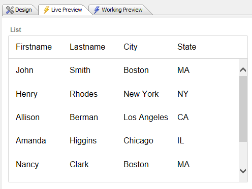
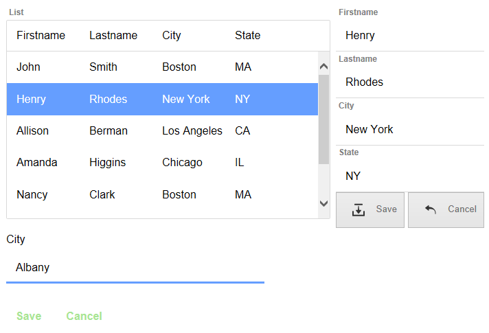
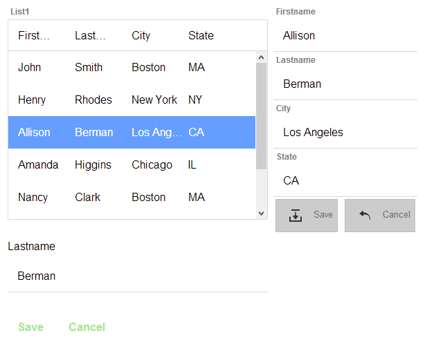
Highlight a row in the List Control and the Form View Control should appear.
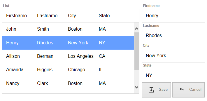
Click on one of the items in the Form View to edit it in the Editor-Textbox.